# 前言
当接到可视化大屏需求时,你是否会有以下疑问👇
- 如何做一款定制化的数据大屏?
- 开发可视化数据大屏如何做自适应?
- vw vh、rem、scale 到底哪种比较好?
- 时间不够,有没有偷懒的方法?
 最近在公司开发了一个可视化大屏,开发定制化大屏,大家可能都一个感受,开发大屏主要是两方面的工作:
大屏之关键-前期的自适应适配根据 ui 稿绘制图表,调细节
而解决了适配问题后,后面就只是一个慢工出细活,耗时间的事情了。
# 适配方案分析
看了网上的各种方案,目前大家采用的大概有 3 种👇
| 方案 | 实现方式 | 优点 | 缺点 |
| --------------| -----------------------------------------------------------| -----------------------------------------------------------| -----------------------------------------------------------|
| vw vh | 1. 按照设计稿的尺寸,将 px 按比例计算转为 vw 和 vh | 1. 可以动态计算图表的宽高,字体等,灵活性较高 2. 当屏幕比例跟 ui 稿不一致时,不会出现两边留白情况 | 1. 每个图表都需要单独做字体、间距、位移的适配,比较麻烦 |
| scale | 1. 通过 scale 属性,根据屏幕大小,对图表进行整体的等比缩放 | 1. 代码量少,适配简单 2. 一次处理后不需要在各个图表中再去单独适配 | 1. 因为是根据 ui 稿等比缩放,当大屏跟 ui 稿的比例不一样时,会出现周边留白情况 2. 当缩放比例过大时候,字体会有一点点模糊,就一点点 3. 当缩放比例过大时候,事件热区会偏移。 |
| rem + vw vh | 1. 获得 rem 的基准值 2. 动态的计算 html根元素的font-size 3. 图表中通过 vw vh 动态计算字体、间距、位移等 | 1. 布局的自适应代码量少,适配简单 | 1. 因为是根据 ui 稿等比缩放,当大屏跟 ui 稿的比例不一样时,会出现周边留白情况 2. 图表需要单个做字体、间距、位移的适配 |
以上 3 种方案在实际应用中该怎么选择视具体情况而定,也有看到大家说自适应在地图的适配中会有一些兼容问题,我这边还没有实践过。
如果想简单,客户能同意留白,选用 scale 即可
如果需要兼容不同比例的大屏,并且想在不同比例中都有比较好的效果,图表占满屏幕,类似于移动端的响应式,可以采用 vw vh 的方案
至于 rem,个人觉得就是 scale 和 vw vh 的综合,最终的效果跟 scale 差不多
接下来介绍下三种方案的具体实现,方案中的代码都以 vue2.0 和 vue-cli3 搭建的 vue 项目为例,因为是 demo,图表的一些细节就没有过多细致的调整了
# 方案一:vw vh
# 上效果
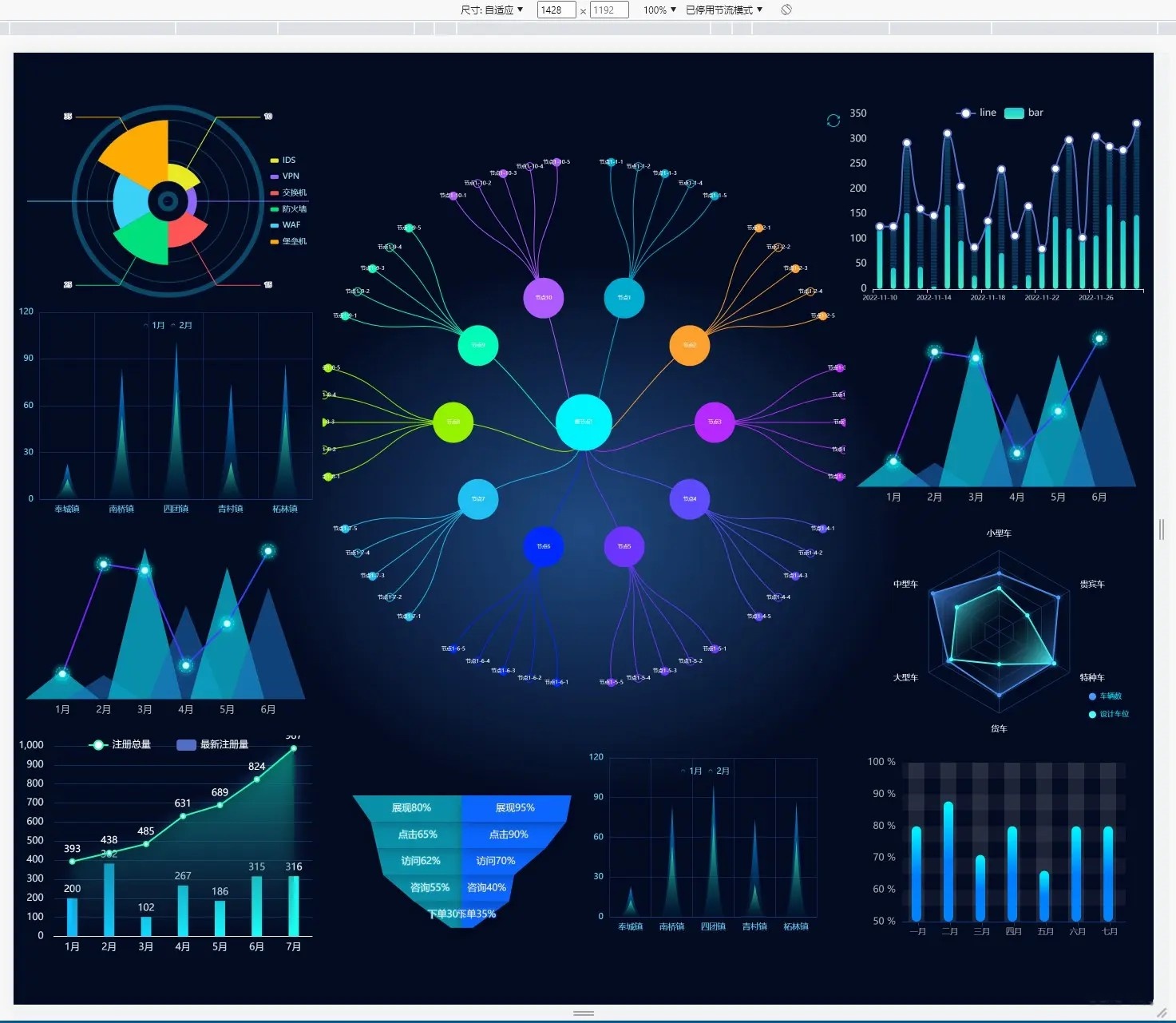
当屏幕的尺寸比例刚好是 16:9 时

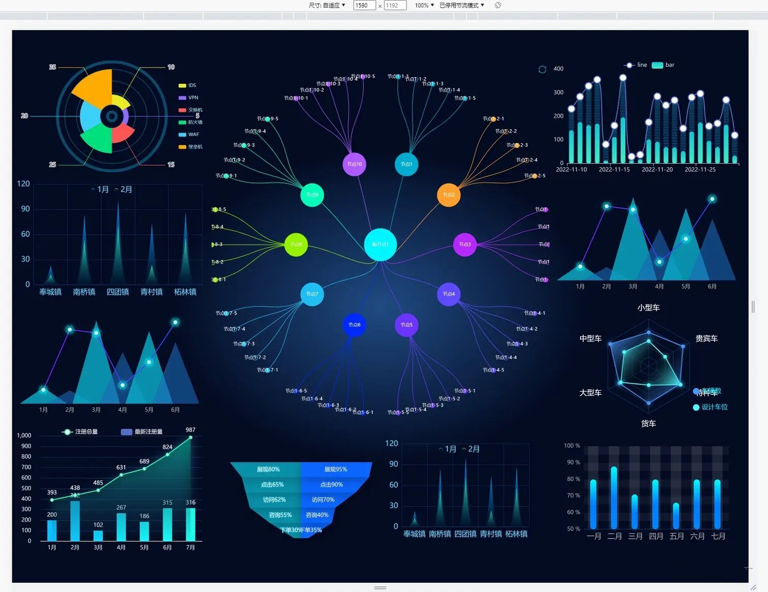
当屏幕的尺寸比例大于 16:9 时

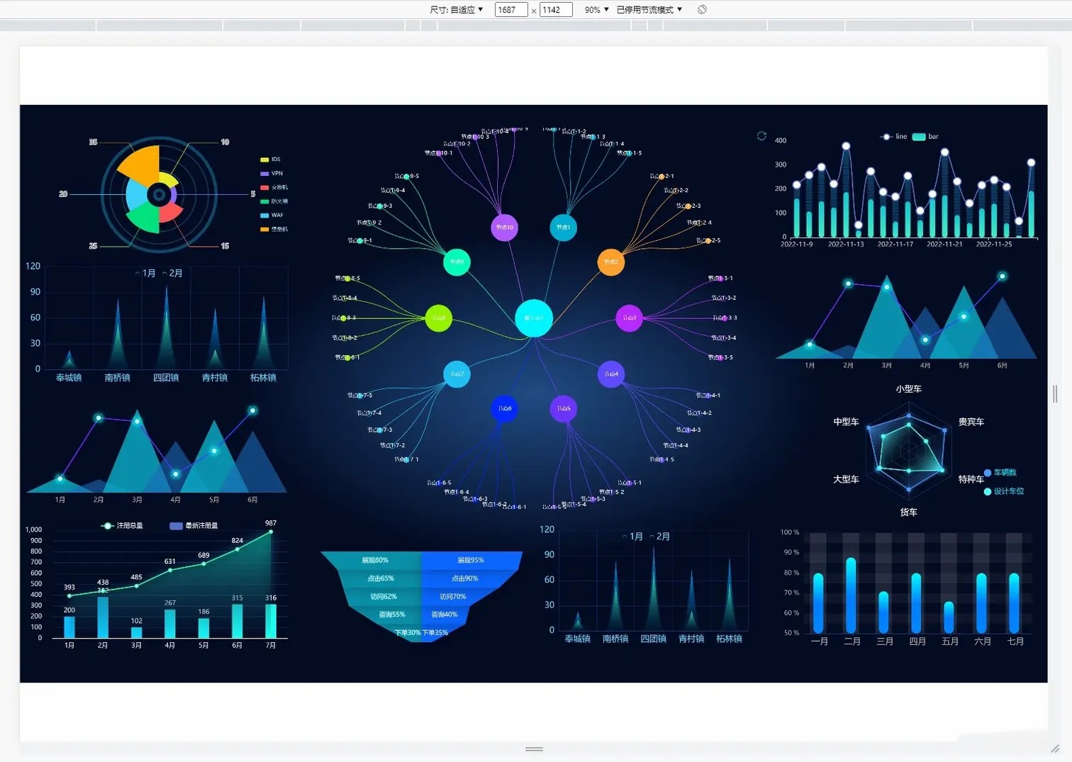
当屏幕的尺寸比例小于 16:9 时
# 实现思路
按照设计稿的尺寸,将 px 按比例计算转为 vw 和 vh ,转换公式如下
假设设计稿尺寸为 1920*1080(做之前一定问清楚 ui 设计稿的尺寸) | |
即: | |
网页宽度=1920px | |
网页高度=1080px | |
我们都知道 | |
网页宽度=100vw | |
网页宽度=100vh | |
所以,在 1920px*1080px 的屏幕分辨率下 | |
1920px = 100vw | |
1080px = 100vh | |
这样一来,以一个宽 300px 和 200px 的 div 来说,其所占的宽高,以 vw 和 vh 为单位,计算方式如下: | |
vwDiv = (300px / 1920px ) * 100vw | |
vhDiv = (200px / 1080px ) * 100vh | |
所以,就在 1920*1080 的屏幕分辨率下,计算出了单个 div 的宽高 | |
当屏幕放大或者缩小时,div 还是以 vw 和 vh 作为宽高的,就会自动适应不同分辨率的屏幕 |
# 话不多说,上代码
# css 方案 sass
util.scss
// 使用 scss 的 math 函数,https://sass-lang.com/documentation/breaking-changes/slash-div | |
@use "sass:math"; | |
// 默认设计稿的宽度 | |
$designWidth: 1920; | |
// 默认设计稿的高度 | |
$designHeight: 1080; | |
//px 转为 vw 的函数 | |
@function vw($px) { | |
@return math.div($px, $designWidth) * 100vw; | |
} | |
//px 转为 vh 的函数 | |
@function vh($px) { | |
@return math.div($px, $designHeight) * 100vh; | |
} |
路径配置
只需在 vue.config.js 里配置一下 utils.scss 的路径,就可以全局使用了
vue.config.js
const path = require("path"); | |
function resolve(dir) { | |
return path.join(__dirname, dir); | |
} | |
module.exports = { | |
publicPath: "", | |
configureWebpack: { | |
name: "app name", | |
resolve: { | |
alias: { | |
"@": resolve("src"), | |
}, | |
}, | |
}, | |
css: { | |
// 全局配置 utils.scs,详细配置参考 vue-cli 官网 | |
loaderOptions: { | |
sass: { | |
prependData: `@import "@/styles/utils.scss";`, | |
}, | |
}, | |
}, | |
}; |
在 .vue 中使用
<template> | |
<div class="box"> | |
</div> | |
</template> | |
<script> | |
export default{ | |
name: "Box", | |
} | |
</script> | |
<style lang="scss" scoped="scoped"> | |
/* | |
直接使用 vw 和 vh 函数,将像素值传进去,得到的就是具体的 vw vh 单位 | |
*/ | |
.box{ | |
width: vw(300); | |
height: vh(100); | |
font-size: vh(16); | |
background-color: black; | |
margin-left: vw(10); | |
margin-top: vh(10); | |
border: vh(2) solid red; | |
} | |
</style> |
# css 方案 less
utils.less
@charset "utf-8"; | |
// 默认设计稿的宽度 | |
@designWidth: 1920; | |
// 默认设计稿的高度 | |
@designHeight: 1080; | |
.px2vw(@name, @px) { | |
@{name}: (@px / @designWidth) * 100vw; | |
} | |
.px2vh(@name, @px) { | |
@{name}: (@px / @designHeight) * 100vh; | |
} | |
.px2font(@px) { | |
font-size: (@px / @designWidth) * 100vw; | |
} |
路径配置
在 vue.config.js 里配置一下 utils.less
const path = require("path"); | |
function resolve(dir) { | |
return path.join(__dirname, dir); | |
} | |
module.exports = { | |
publicPath: "", | |
configureWebpack: { | |
name: "app name", | |
resolve: { | |
alias: { | |
"@": resolve("src"), | |
}, | |
}, | |
}, | |
css: { | |
// 全局配置 utils.scss | |
loaderOptions: { | |
less: { | |
additionalData: `@import "@/styles/utils.less";`, | |
}, | |
}, | |
}, | |
}; |
在 .vue 文件中使用
<template> | |
<div class="box"> | |
</div> | |
</template> | |
<script> | |
export default{ | |
name: "Box", | |
} | |
</script> | |
<style lang="less" scoped="scoped"> | |
/* | |
直接使用 vw 和 vh 函数,将像素值传进去,得到的就是具体的 vw vh单位 | |
*/ | |
.box{ | |
.px2vw(width, 300); | |
.px2vh(height, 100); | |
.px2font(16); | |
.px2vw(margin-left, 300); | |
.px2vh(margin-top, 100); | |
background-color: black; | |
} | |
</style> |
# 定义 js 样式处理函数
// 定义设计稿的宽高 | |
const designWidth = 1920; | |
const designHeight = 1080; | |
//px 转 vw | |
export const px2vw = (_px) => { | |
return (_px * 100.0) / designWidth + 'vw'; | |
}; | |
export const px2vh = (_px) => { | |
return (_px * 100.0) / designHeight + 'vh'; | |
}; | |
export const px2font = (_px) => { | |
return (_px * 100.0) / designWidth + 'vw'; | |
}; |
# 屏幕变化后,图表自动调整
这种使用方式有个弊端,就是屏幕尺寸发生变化后,需要手动刷新一下才能完成自适应调整
为了解决这个问题,你需要在各个图表中监听页面尺寸变化,重新调整图表,在 vue 项目中,也可以借助 element-resize-detector ,最好封装个 resize 的指令,在各图表中就只要使用该指令就可以了,毕竟作为程序员,能偷懒就偷懒
- 安装
element-resize-detector
npm install element-resize-detector --save
- 引入工具包在组件中使用或者在单独的 js 中使用
import resizeDetector from 'element-resize-detector'
- 封装 directive
// directive.js | |
import * as ECharts from "echarts"; | |
import elementResizeDetectorMaker from "element-resize-detector"; | |
import Vue from "vue"; | |
const HANDLER = "_vue_resize_handler"; | |
function bind(el, binding) { | |
el[HANDLER] = binding.value | |
? binding.value | |
: () => { | |
let chart = ECharts.getInstanceByDom(el); | |
if (!chart) { | |
return; | |
} | |
chart.resize(); | |
}; | |
// 监听绑定的 div 大小变化,更新 echarts 大小 | |
elementResizeDetectorMaker().listenTo(el, el[HANDLER]); | |
} | |
function unbind(el) { | |
// window.removeEventListener("resize", el[HANDLER]); | |
elementResizeDetectorMaker().removeListener(el, el[HANDLER]); | |
delete el[HANDLER]; | |
} | |
// 自定义指令:v-chart-resize 示例:v-chart-resize="fn" | |
Vue.directive("chart-resize", { bind, unbind }); |
main.js中引入
import '@/directive/directive'; |
- html 代码
<template> | |
<div class="linechart"> | |
<div ref="chart" v-chart-resize class="chart"></div> | |
</div> | |
</template> |
这里要注意的是,图表中如果需要 tab 切换动态更新图表数据,在更新数据时一定不要用 echarts 的 dispose 方法先将图表移除,再重新绘制,因为 resize 指令中挂载到的图表实例还是旧的,就监听不到新的 chart 元素的 resize 了,更新数据只需要用 chart 的 setOption 方法重新设置配置项即可。
# 图表字体、间距、位移等尺寸自适应
echarts 的字体大小只支持具体数值(像素),不能用百分比或者 vw 等尺寸,一般字体不会去做自适应,当宽高比跟 ui 稿比例出入太大时,会出现文字跟图表重叠的情况
 这里我们就需要封装一个工具函数,来处理图表中文字自适应了👇
默认情况下,这里以你的设计稿是 1920*1080 为例,即网页宽度是 1920px (做之前一定问清楚 ui 设计稿的尺寸)
把这个函数写在一个单独的工具文件 dataUtil.js 里面,在需要的时候调用
其原理是计算出当前屏幕宽度和默认设计宽度的比值,将原始的尺寸乘以该值
另外,其它 echarts 的配置项,比如间距、定位、边距也可以用该函数
- 编写 dataUtil.js 工具函数
// Echarts 图表字体、间距自适应 | |
export const fitChartSize = (size,defalteWidth = 1920) => { | |
let clientWidth = window.innerWidth||document.documentElement.clientWidth||document.body.clientWidth; | |
if (!clientWidth) return size; | |
let scale = (clientWidth / defalteWidth); | |
return Number((size*scale).toFixed(3)); | |
} |
- 将函数挂载到原型上
import {fitChartSize} from '@src/utils/dataUtil.js' | |
Vue.prototype.fitChartFont = fitChartSize; |
- 这样你可以在
.vue文件中直接使用this.fitChartSize()调用
<template> | |
<div class="chartsdom" ref="chart" v-chart-resize></div> | |
</template> | |
<script> | |
export default { | |
name: "dashboardChart", | |
data() { | |
return { | |
option: null, | |
}; | |
}, | |
mounted() { | |
this.getEchart(); | |
}, | |
methods: { | |
getEchart() { | |
let myChart = this.$echarts.init(this.$refs.chart); | |
const option = { | |
backgroundColor: "transparent", | |
tooltip: { | |
trigger: "item", | |
formatter: "{a} <br/>{b} : {c}%", | |
}, | |
grid: { | |
left: this.fitChartSize(10), | |
right: this.fitChartSize(20), | |
top: this.fitChartSize(20), | |
bottom: this.fitChartSize(10), | |
containLabel: true, | |
}, | |
calculable: true, | |
series: [ | |
{ | |
color: ["#0db1cdcc"], | |
name: "计划投入", | |
type: "funnel", | |
width: "45%", | |
height: "70%", | |
x: "5%", | |
minSize: "10%", | |
funnelAlign: "right", | |
center: ["50%", "50%"], // for pie | |
data: [ | |
{ | |
value: 30, | |
name: "下单30%", | |
}, | |
{ | |
value: 55, | |
name: "咨询55%", | |
}, | |
{ | |
value: 65, | |
name: "点击65%", | |
}, | |
{ | |
value: 60, | |
name: "访问62%", | |
}, | |
{ | |
value: 80, | |
name: "展现80%", | |
}, | |
].sort(function (a, b) { | |
return a.value b.value; | |
}), | |
roseType: true, | |
label: { | |
normal: { | |
formatter: function () {}, | |
position: "inside", | |
}, | |
}, | |
itemStyle: { | |
normal: { | |
borderWidth: 0, | |
shadowBlur: this.fitChartSize(20), | |
shadowOffsetX: 0, | |
shadowOffsetY: this.fitChartSize(5), | |
shadowColor: "rgba(0, 0, 0, 0.3)", | |
}, | |
}, | |
}, | |
{ | |
color: ["#0C66FF"], | |
name: "实际投入", | |
type: "funnel", | |
width: "45%", | |
height: "70%", | |
x: "50%", | |
minSize: "10%", | |
funnelAlign: "left", | |
center: ["50%", "50%"], // for pie | |
data: [ | |
{ | |
value: 35, | |
name: "下单35%", | |
}, | |
{ | |
value: 40, | |
name: "咨询40%", | |
}, | |
{ | |
value: 70, | |
name: "访问70%", | |
}, | |
{ | |
value: 90, | |
name: "点击90%", | |
}, | |
{ | |
value: 95, | |
name: "展现95%", | |
}, | |
].sort(function (a, b) { | |
return a.value b.value; | |
}), | |
roseType: true, | |
label: { | |
normal: { | |
position: "inside", | |
}, | |
}, | |
itemStyle: { | |
normal: { | |
borderWidth: 0, | |
shadowBlur: this.fitChartSize(20), | |
shadowOffsetX: 0, | |
shadowOffsetY: this.fitChartSize(5), | |
shadowColor: "rgba(0, 0, 0, 0.3)", | |
}, | |
}, | |
}, | |
], | |
}; | |
myChart.setOption(option, true); | |
}, | |
}, | |
beforeDestroy() {}, | |
}; | |
</script> | |
<style lang="scss" scoped> | |
.chartsdom { | |
width: 100%; | |
height: 100%; | |
} | |
</style> |
# 方案二:scale
通过 css 的 scale 属性,根据屏幕大小,对图表进行整体的等比缩放,从而达到自适应效果
# 上效果
当屏幕的尺寸比例刚好是 16:9 时,页面能刚好全屏展示,内容占满显示器

当屏幕的尺寸比例小于 16:9 时,页面上下留白,左右占满并上下居中,显示比例保持 16:9
当屏幕尺寸比例大于 16:9 时,页面左右留白,上下占满并居中,显示比例保持 16:9
# 话不多说,上代码
html 部分
  <div className="screen-wrapper">
      <div className="screen" id="screen">

      </div>
   </div>
js 部分
<script> | |
export default { | |
mounted() { | |
// 初始化自适应 ---- 在刚显示的时候就开始适配一次 | |
handleScreenAuto(); | |
// 绑定自适应函数 --- 防止浏览器栏变化后不再适配 | |
window.onresize = () => handleScreenAuto(); | |
}, | |
deleted() { | |
window.onresize = null; | |
}, | |
methods: { | |
// 数据大屏自适应函数 | |
handleScreenAuto() { | |
const designDraftWidth = 1920; // 设计稿的宽度 | |
const designDraftHeight = 960; // 设计稿的高度 | |
// 根据屏幕的变化适配的比例 | |
const scale = | |
document.documentElement.clientWidth / | |
document.documentElement.clientHeight < | |
designDraftWidth / designDraftHeight | |
? document.documentElement.clientWidth / designDraftWidth | |
: document.documentElement.clientHeight / designDraftHeight; | |
// 缩放比例 | |
document.querySelector( | |
'#screen', | |
).style.transform = `scale(${scale}) translate(-50%, -50%)`; | |
}, | |
}, | |
}; | |
</script> |
css 部分
/* | |
除了设计稿的宽高是根据您自己的设计稿决定以外,其他复制粘贴就完事 | |
*/ | |
.screen-root { | |
height: 100%; | |
width: 100%; | |
.screen { | |
display: inline-block; | |
width: 1920px; //设计稿的宽度 | |
height: 960px; //设计稿的高度 | |
transform-origin: 0 0; | |
position: absolute; | |
left: 50%; | |
top: 50%; | |
} | |
} |
# 实现思路
如何缩放
当 屏幕宽高比 < 设计稿宽高比 ,我们需要缩放的比例是 屏幕宽度 / 设计稿宽度
当 屏幕宽高比 > 设计稿宽高比 ,我们需要缩放的比例是 屏幕高度 / 设计稿高度
const scale = document.documentElement.clientWidth / document.documentElement.clientHeight < designDraftWidth / designDraftHeight ? | |
(document.documentElement.clientWidth / designDraftWidth) : | |
(document.documentElement.clientHeight / designDraftHeight); |
如果我们拿到的设计稿宽高为: 1920 * 960 px ,而我们的屏幕大小是 1440 * 900 px,那么 1440/900 = 1.6,920/960 = 2
因为 1.6 < 2 (当前屏幕宽高比小于设计稿宽高比)
所以我们需要缩放的比例是:屏幕宽度除以设计稿宽度 = 1440/1920 = 0.75
如何居中
首先我们利用 transform:translate(-50%,-50%) ,将动画的基点设为左上角
transform-origin:设置动画的基点 (中心点),默认点是元素的中心点
语法
transform-origin: x-axis y-axis z-axis;
然后利用 transform:translate(-50%,-50%) ,将图表沿 x,y 轴移动 50%
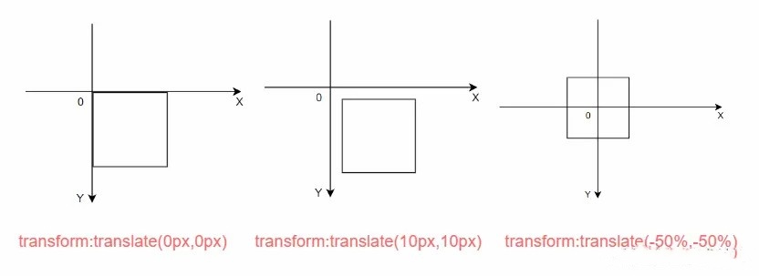
接下来利用 绝对定位 将图表定位到中间位置
position: absolute; | |
left: 50%; | |
top: 50%; |
# 偷懒方法 - 插件
v-scale-screen 是使用 css 属性 transform 实现缩放效果的一个大屏自适应组件,通过 scale 进行等比例计算,达到等比例缩放的效果,同时也支持铺满全屏,宽度等比,高度等比,等自适应方案,具体可查大屏自适应终极解决方案
# 方案三:rem + vw wh
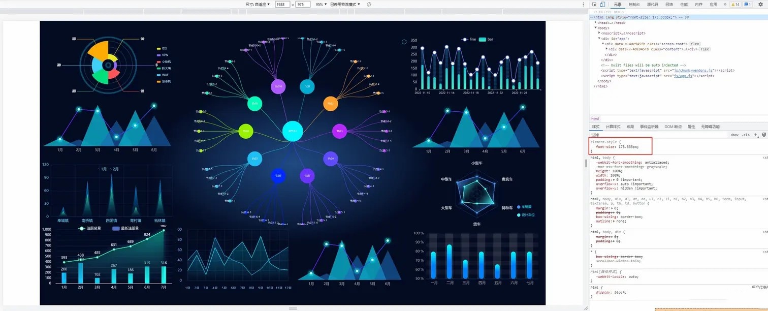
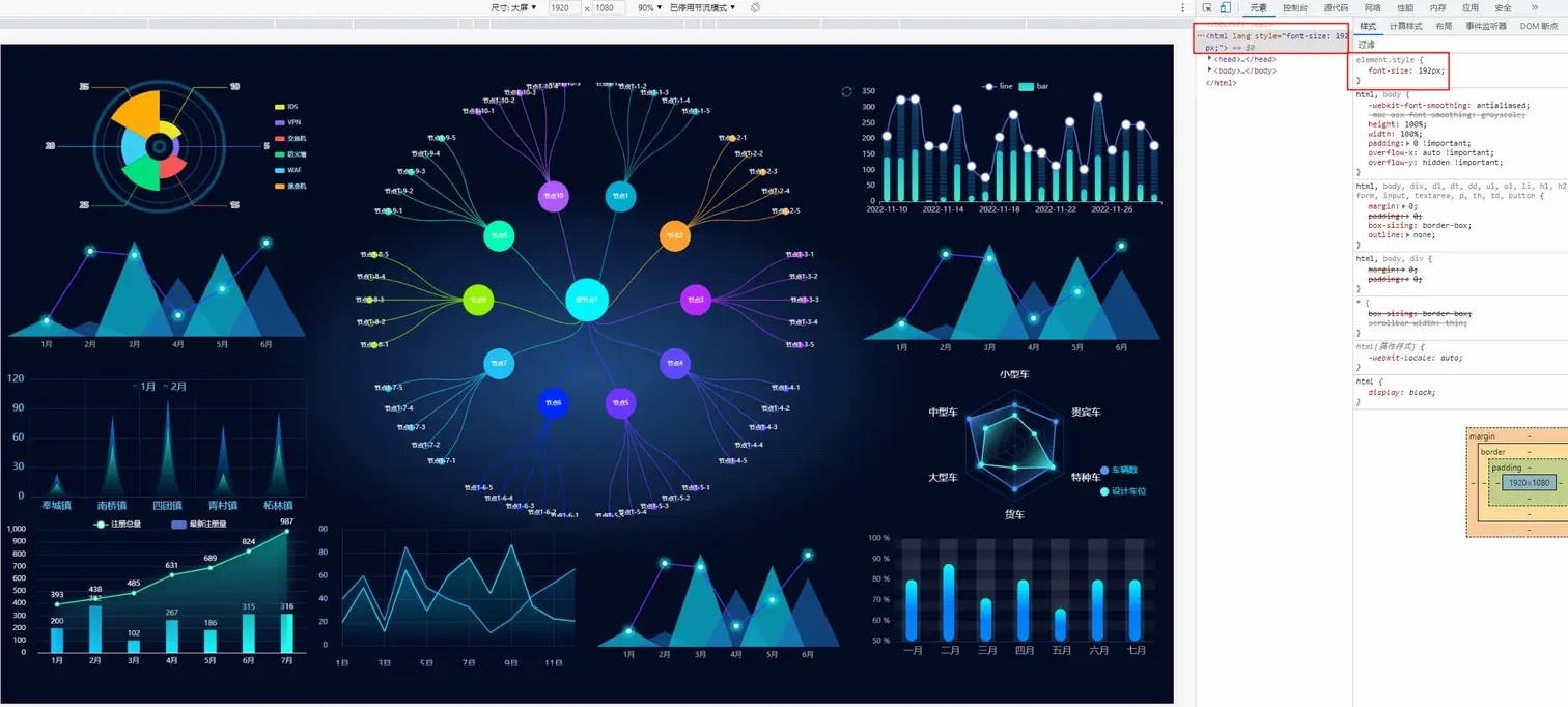
# 上效果
当屏幕的尺寸比例刚好是 16:9 时,页面能刚好全屏展示,内容占满显示器

当屏幕的尺寸比例小于 16:9 时,页面上下留白,左右占满并上下居中,显示比例保持 16:9
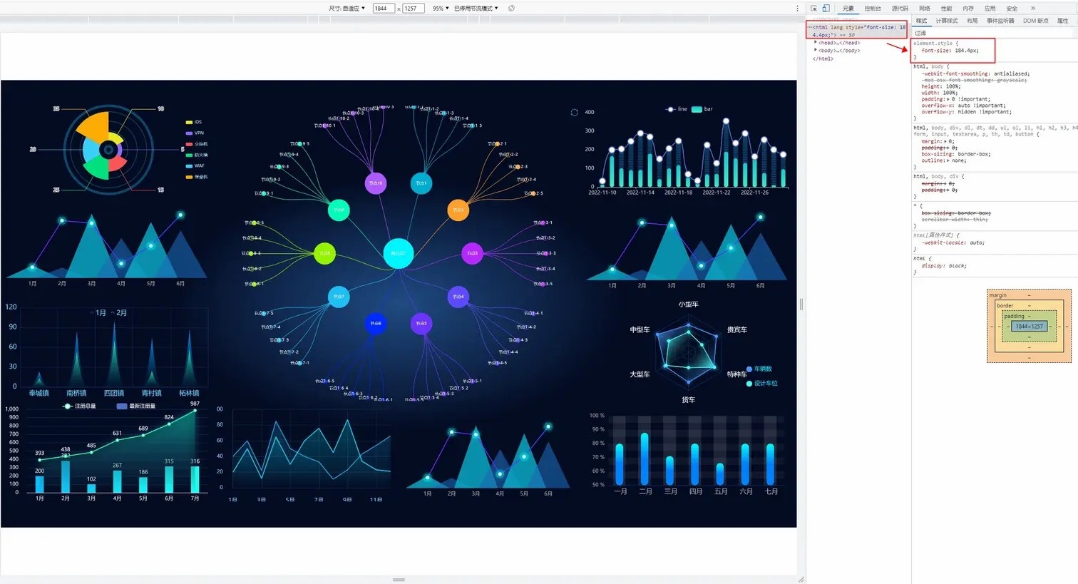
当屏幕尺寸比例大于 16:9 时,页面左右留白,上下占满并居中,显示比例保持 16:9
# 实现思路
关于 remrem(font size of the root element) ,是 css3 中新增的一个大小单位,即相对于根元素 font-size 值的大小。
自适应思路
动态的计算出页面的 fontsize 从而改变 rem 的大小。
- 拿 1920 * 1080 的标准屏幕大小为例,将屏幕分为
10份,先计算rem 的基准值:1920 / 10 = 192; - 把所有元素的长、宽、位置、字体大小等原来的 px 单位全部转换成 rem;
- 网页加载后,用 js 去计算当前浏览器的宽度,并设置 html 的 font-size 为 (
当前浏览器窗口宽度 / 10) 。
这样的话 10rem 就刚好等于浏览器窗口的宽度,也就可以保证 100% 宽度,等比例缩放设计稿的页面了。![rem01.jpg]()
因此 rem + vw vh 方案要解决三件事
- 获得 rem 的基准值;
- 页面内写一段 js 代码,动态的计算
html根元素的font-size; - 屏幕变化后,图表自动调整和图表字体、间距、位移等的自适应。
# 实现方案
第一点:获得 rem 的基准值
- 首先安装
@njleonzhang/postcss-px-to-rem这个包
npm i @njleonzhang/postcss-px-to-rem -D |
- 在项目根目录新建
.postcssrc.js配置文件
module.exports = { | |
plugins: { | |
autoprefixer: {}, | |
"@njleonzhang/postcss-px-to-rem": { | |
unitToConvert: 'px', // (String) 要转换的单位,默认是 px。 | |
widthOfDesignLayout: 1920, // (Number) 设计布局的宽度。对于 pc 仪表盘,一般是 1920. | |
unitPrecision: 3, // (Number) 允许 rem 单位增长到的十进制数字. | |
selectorBlackList: ['.ignore', '.hairlines'], // (Array) 要忽略并保留为 px 的选择器. | |
minPixelValue: 1, // (Number) 设置要替换的最小像素值. | |
mediaQuery: false // (Boolean) 允许在媒体查询中转换 px. | |
} | |
} | |
} |
- 配置完成后,页面内的 px 就会被转换成 rem 了
第二点:动态的计算 html根元素的font-size
- 在工具函数文件中新建一个 rem.js 文件,用于动态计算 font-size
(function init(screenRatioByDesign = 16 / 9) { | |
let docEle = document.documentElement | |
function setHtmlFontSize() { | |
var screenRatio = docEle.clientWidth / docEle.clientHeight; | |
var fontSize = ( | |
screenRatio > screenRatioByDesign | |
? (screenRatioByDesign / screenRatio) | |
: 1 | |
) * docEle.clientWidth / 10; | |
docEle.style.fontSize = fontSize.toFixed(3) + "px"; | |
console.log(docEle.style.fontSize); | |
} | |
setHtmlFontSize() | |
window.addEventListener('resize', setHtmlFontSize) | |
})() |
- 在入口文件 main.js 中引入 rem.js 文件
import './utils/rem.js'; |
至此,页面就已经可以实现 16:9 自适应了。
第三点:屏幕变化,图表自适应
屏幕变化后,图表自动调整字体、间距、位移等,此处参考上面 vw vh 的实现方式即可,在此就不重复赘述了
# 参考资料
推荐一个 echarts 的案列网站,需要什么直接图表直接在上面去找,可以省去很多查 echarts 配置的时间
全网 echarts 案例资源大总结和 echarts 的高效使用技巧(细节版)
scale 方案参考: 数据大屏最简单自适应方案,无需适配 rem 单位
vw vh 方案参考: Vue+Echarts 企业级大屏项目适配方案
rem 方案参考:数据大屏 rem 适配方案
原文